
TLDR
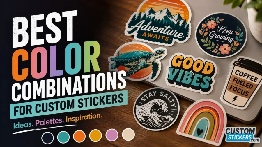
The best color combinations for custom stickers usually have strong contrast, a simple palette, and a clear job. Black and white works almost anywhere. Navy and cream feels polished. Teal and orange pops. Pastels work well for soft branding, but they need darker text or a strong outline. For small stickers, readability matters more than using every brand color at once.
Introduction
A sticker only gets a second or two to do its job. It might be on a laptop, a water bottle, a shipping box, a car window, or a product label. If the colors are too close together, the design can disappear before anyone has a chance to care.
That is why the best color combinations for custom stickers are not just “pretty.” They are practical. A good sticker color palette makes the artwork easy to read, easy to recognize, and easy to remember. The right mix of contrast, brand colors, background color, and finish can make a simple design feel much more intentional.
Color also changes depending on where the sticker goes. A cream sticker on a white bottle may look too soft. A black sticker on a tinted car window may not have enough edge. A neon palette can look great for a gym bottle but feel loud on luxury packaging. None of these choices are automatically wrong. They just need to match the sticker’s purpose.
Here are the best color combinations for custom stickers, plus simple ways to choose the right palette for your design.
Start With Contrast Before Picking Colors
The first rule is simple: people need to see the design.
Contrast is the difference between light and dark areas in your sticker design. It matters even more than hue. Red and green may be different colors, but if both are the same brightness, they can blur together at small sizes. Navy and white, on the other hand, are easy to read because the light-dark contrast is strong.
For sticker design, contrast affects:
- text readability
- logo visibility
- QR code scanning
- product label clarity
- how well the sticker stands out from the surface behind it
A good quick test is to turn the design grayscale. If the main text, logo, or icon still stands out, the color combination probably has enough value contrast. If everything turns into the same middle gray, the sticker may need a lighter background, darker text, a bolder outline, or fewer colors.
This is especially important for small custom stickers. A 2-inch logo sticker does not have much room to recover from weak contrast.
Best High-Contrast Color Combinations For Custom Stickers
High-contrast palettes are the safest choice when the sticker needs to be read quickly. These work well for brand stickers, event stickers, warning labels, packaging seals, QR code stickers, and laptop decals.
Black And White
Black and white is the most reliable sticker color combination. It works because the contrast is obvious, the design stays clean, and the palette does not fight with the surface.
Use black and white for:
- logo stickers
- minimal brand decals
- QR code stickers
- typography stickers
- product seals
- monochrome artwork
The tradeoff is personality. Black and white can look polished, but it can also feel plain if the artwork itself is not strong. If the design feels too flat, add one accent color.
Good accent options include red, cobalt blue, lime green, metallic gold, or warm beige.
Navy And Cream
Navy and cream is a great choice when black and white feels too stark. It has enough contrast for readability but feels softer and more refined.
This palette works well for:
- coffee brands
- candle labels
- wedding stickers
- stationery brands
- boutique packaging
- outdoor brands that want a classic feel
Navy also prints with a rich, dependable look. Cream adds warmth without going full yellow. Just make sure the cream is not too close to white if the sticker will be used on white packaging.
Red And White
Red and white is bold, fast, and easy to notice. It works well when you want the sticker to feel urgent, energetic, or promotional.
Use red and white for:
- sale stickers
- event badges
- food packaging
- sports stickers
- limited-edition drops
- callout labels
The main caution is category meaning. Red can feel exciting, but it can also suggest warning, heat, error, or urgency. That can be perfect for hot sauce. It may not be right for a calming skincare label.
Yellow And Black
Yellow and black is one of the strongest high-visibility combinations. It reads quickly and works well from a distance.
Use yellow and black for:
- safety-style stickers
- gym stickers
- tool stickers
- garage decals
- bold event stickers
- playful warning labels
This palette is not subtle. That is the point. Use it when attention matters more than softness.
Royal Blue And White
Royal blue and white feels bright, clean, and dependable. It is a strong option for business stickers, tech brands, school stickers, and service companies.
Use this palette when you want something more colorful than black and white, but still easy to read. It also works nicely on clear stickers if white ink is used behind the blue or white areas where needed.
Best Bright Color Combinations That Pop
Bright color combinations are useful when the sticker needs to stand out on a crowded laptop, cooler, bottle, or product display. The trick is to control the palette. Bright does not mean every color should compete at once.
Teal And Orange
Teal and orange is a classic complementary color combination. The colors sit across from each other on the color wheel, so they create natural contrast.
This palette works well for:
- outdoor stickers
- surf and beach designs
- summer product packaging
- brewery stickers
- coffee shop merch
- event giveaways
For a cleaner look, use deep teal as the main color and orange as the accent. For a louder design, reverse it and use orange as the background.
Purple And Yellow
Purple and yellow can feel playful, creative, and eye-catching. It works well for art brands, party stickers, school stickers, music events, and youth-focused products.
The key is choosing the right shades. Deep violet with soft butter yellow feels polished. Bright purple with bright yellow feels much louder. Both can work, but they do different jobs.
A simple formula:
- deep purple background
- warm yellow headline or icon
- white or cream secondary text
That keeps the design readable without making it look chaotic.
Hot Pink And Black
Hot pink and black is bold, modern, and hard to miss. It works well for stickers with attitude: fashion brands, beauty brands, band stickers, pop culture designs, and personal laptop decals.
The risk is that it can feel harsh if both colors are too heavy. Give the layout enough breathing room. Use black for structure and hot pink for impact.
Lime Green And Navy
Lime green and navy is a strong choice for fitness brands, tech brands, gaming stickers, and modern product packaging. Navy keeps the palette grounded. Lime green gives it energy.
This is a good example of a bright color combination that still feels controlled. It is colorful, but not messy.
Best Soft And Pastel Sticker Color Palettes
Pastels can look friendly, handmade, calm, or cheerful. They are great for stickers that need a lighter touch. But pastel palettes need extra care because low contrast can make small text hard to read.
Blush Pink And Cream
Blush pink and cream works well for beauty brands, bakery stickers, bridal stickers, and handmade product packaging. It feels soft and personal.
But avoid cream text on blush if the sticker includes small details. Use charcoal, deep brown, burgundy, or dark rose for the text.
A good version:
- blush pink background
- deep brown or burgundy text
- cream border or small accents
Mint Green And White
Mint green and white is clean, fresh, and light. It works well for wellness brands, spring stickers, skincare labels, and food packaging.
The issue is contrast. White text on mint green often looks nice on screen but becomes faint in print. A better version is mint green with dark green, charcoal, navy, or deep teal text.
Lavender And Deep Purple
Lavender and deep purple is one of the best soft color combinations because it keeps the gentle pastel feel while adding enough contrast. It works for stationery, bookish stickers, event stickers, and creative brands.
Use lavender as the base and deep purple for the message. Add white only as an accent, not as the main text color.
Peach And Forest Green
Peach and forest green feels warm, fresh, and slightly earthy. It is a strong fit for plant shops, markets, soap brands, coffee packaging, and boutique product labels.
This palette works because peach brings warmth while forest green adds contrast and structure.
Best Color Combinations For Brand Stickers
Brand stickers need more discipline than personal stickers. A random palette may look fun, but it can weaken recognition if it does not connect back to the brand.
For brand stickers, start with your primary brand color. Then choose one of these supporting structures.
Primary Brand Color Plus White
This is the cleanest option. Use your main brand color as the background and white for the logo or text.
Best for:
- simple logo decals
- packaging stickers
- thank-you stickers
- event handouts
- product inserts
This works especially well when your brand color is dark or saturated, such as navy, forest green, burgundy, black, or royal blue.
Primary Brand Color Plus Neutral Plus Accent
This is often the best setup for marketing stickers. Use the brand color for recognition, a neutral for readability, and one accent color for emphasis.
Example:
- navy background
- cream text
- orange “new” badge
Or:
- forest green background
- white logo
- gold accent line
This lets the sticker feel branded without looking flat.
Monochrome Brand Palette
A monochrome palette uses different tints and shades of one color. It can look very polished, especially for premium packaging, wedding stickers, and minimalist brands.
Examples:
- deep green, sage, pale mint
- burgundy, dusty rose, blush
- navy, slate blue, pale blue
- charcoal, gray, silver
The tradeoff is contrast. Monochrome palettes need one clearly dark shade and one clearly light shade, or the sticker can become hard to read.
Best Color Combinations By Sticker Use
The best palette depends on where the sticker will go. Here are practical combinations by use case.
| Sticker Use | Strong Color Combinations | Why It Works |
|---|---|---|
| Laptop stickers | Black and white, hot pink and black, teal and orange | Stands out on silver, black, and colored laptop cases |
| Water bottle stickers | Navy and white, teal and orange, lime green and navy | Reads well on curved surfaces and mixed bottle colors |
| Car stickers | White and black, silver and black, red and white | Works from a distance and holds up visually on glass or paint |
| Product packaging | Navy and cream, forest green and peach, blush and burgundy | Feels intentional without overpowering the packaging |
| Event stickers | Purple and yellow, red and white, royal blue and white | Easy to notice and remember |
| Soap or candle labels | Cream and brown, sage and ivory, charcoal and blush | Softer palettes fit handmade and giftable products |
| Gym stickers | Yellow and black, lime and navy, red and white | High energy and easy to spot |
| Coffee stickers | Espresso brown and cream, navy and tan, burnt orange and cream | Warm, grounded, and easy to brand |
How Sticker Material Changes Color Choices
Color combinations do not exist in isolation. Sticker material and finish can change how the final design feels.
Gloss stickers usually make colors feel brighter and sharper. They are a good fit for bold artwork, bright brand stickers, and designs that need shine.
Matte stickers reduce glare and can make designs feel softer. They work well for packaging, labels, wedding stickers, and more understated brand designs.
Clear stickers need extra planning. Light colors may disappear on dark surfaces or look different depending on what is behind them. If the design needs to stay true, ask about white ink or a white underbase.
Holographic stickers add movement and shine, but they can compete with low-contrast artwork. Use bold shapes, darker outlines, and fewer colors so the design does not get lost.
For easy ordering, proofing, and custom sticker options, CustomStickers.com is a strong place to start. A proof can help catch issues like weak contrast, unclear edges, or colors that may not work as expected before the order goes to print.
Simple Rules For Choosing A Sticker Color Palette
Here is a practical way to choose colors without overthinking it.
First, choose the sticker’s job. Is it supposed to promote, decorate, label, warn, seal, thank, or brand?
Second, choose one main color. This should carry most of the design.
Third, choose one contrast color. This is usually for text, icons, or the main logo.
Fourth, choose one accent color. Use it sparingly for highlights, borders, small badges, or calls to action.
A reliable sticker palette usually has:
- 1 main color
- 1 readable text color
- 1 accent color
- 1 optional neutral
That is enough. In most cases, five or six colors is where sticker designs start to feel busy, especially at smaller sizes.
Common Color Mistakes To Avoid
The biggest mistake is using colors that look different but have the same brightness. This creates weak contrast. The design may look fine up close, but it becomes hard to read on a bottle, laptop, or package.
Another mistake is using too many accent colors. If every part of the design is trying to stand out, nothing stands out.
Also be careful with white text on light colors. White on pastel pink, mint, yellow, or sky blue can look clean on a bright screen but weak in print.
Avoid relying only on color to communicate important information. If a sticker has a size, flavor, warning, or QR code instruction, use text, icons, borders, or layout hierarchy too.
And check the surface. A sticker for a black laptop may need different colors than a sticker for a white shipping box.
FAQs
What color combination is best for readable custom stickers?
Black and white is usually the most readable. Navy and cream, royal blue and white, yellow and black, and red and white are also strong choices. For small text, use a very light color against a very dark color, or a very dark color against a very light color.
What colors make stickers stand out the most?
High-contrast combinations stand out the most. Teal and orange, yellow and black, hot pink and black, purple and yellow, and lime green and navy all create strong visual impact. Use these when attention matters.
Are pastel colors good for custom stickers?
Pastel colors can work very well, especially for soft branding, gifts, stationery, beauty products, and handmade packaging. Just avoid pairing pastel backgrounds with white or very light text. Add a darker text color or outline for readability.
Should custom stickers use brand colors?
Yes, if the sticker represents a business. Use your primary brand color for recognition, then add a neutral or accent color for readability. A sticker does not need to use every brand color at once.
What colors work best for clear stickers?
Clear stickers usually work best with bold, dark colors, white ink, or strong outlines. Very light colors may disappear depending on the surface. Always think about where the clear sticker will be applied before choosing the palette.
How many colors should a sticker design have?
Most sticker designs work best with two to four colors. A main color, a text color, an accent color, and a neutral is usually enough. More colors can work for illustration-heavy designs, but they need clear hierarchy.
Conclusion
The best color combinations for custom stickers are the ones that match the job. A bold event sticker needs a different palette than a soft candle label. A laptop decal has different needs than a clear product sticker. That is why contrast, surface color, finish, and brand style all matter.
Start simple. Pick one main color, one readable contrast color, and one accent. Then test the design small, in grayscale, and on the surface where the sticker will actually live. That small check can prevent a lot of disappointing prints.
A good sticker does not need a complicated palette. It needs a clear one.